
Doctor Who Brand Identity
Strategy, Design, Animation, Sound Design, Tone of Voice & Launch Campaign
Regenerating
The Doctor
The brand for Doctor Who has undergone several transformations over the years, much like its Timelord protagonist. When BBC Studios set out to reimagine the iconic show as a global franchise, a cohesive brand was needed to support this ambition.
Key Art created for series launch announcement. ©2017 BBC Studios Ltd.
Logo reveal film
Together with the BBC Studios Brands Marketing and Insights teams, we developed the underlying strategy for the brand, defining its approach to key audiences, brand values and tone of voice.
Working with new Showrunner Chris Chibnall and Executive Producer Matt Strevens, we defined a new visual direction for the brand. Our focus was to capture the magic of 54 years of the show whilst embracing the excitement of the next chapter with Jodie Whittaker as the new Doctor.
The letterforms were built from scratch to create a clean, geometric and classic typeface. Angled serif terminals add individuality and the sense of movement
Merchandise from all eras of The Doctor featuring the new identity
Past, present and future.
For the first time in its 44-year history, this new identity was used across all Doctor Who content and merchandise — past, present and future — increasing brand equity with their audiences everywhere.

“What impressed me most was your strategic approach to the work. It’s rare a creative team play back the key elements from a client brief and demonstrate such clear understanding of it.”
— Philip Raperport, Head of Drama Franchise Marketing, BBC Studios
Responsive Logo
To ensure greater versatility of the logo design, we designed a tool that allowed the logo to be scaled up and down without changing the size of the BBC blocks. This gave it more flexibility and ensured the blocks remained legible, giving due attribution back to the BBC.
The Insignia
Crucial to bolstering fandom, and an essential asset for social and small spaces like Blu-ray and book spines. We designed the reduced version of the logo to feel like a mysterious, cult-like stamp. Something fans would be proud to have tattooed on their bodies, and a marque that suggests there’s more to this than meets the eye.
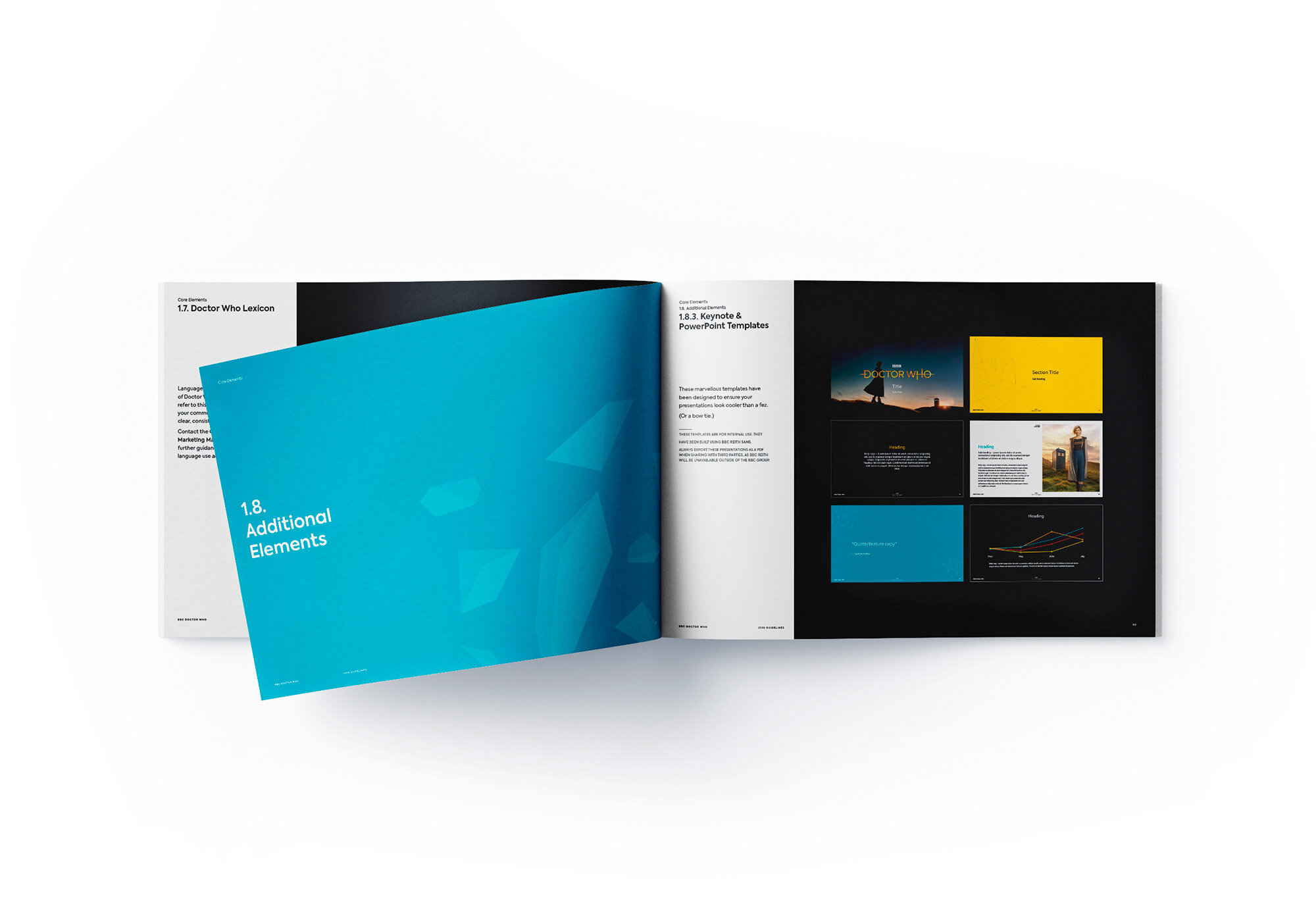
Guidelines

Insignia Flavours

Logo Flavours

Vector Crystal Patterns, used for merchandise

Adaptive Pattern Matrix

Doctor Who Magazine covers

Guidelines

