Twig Education Brand Identity
Strategy, Design & Tone of Voice
Twig focuses on self-driven STEM education through online videos
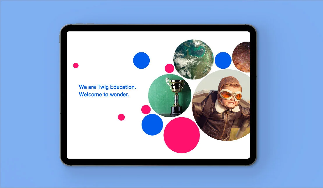
Welcome to wonder
Twig Education came to us at a crucial juncture: they were planning their expansion into the US market and felt their existing brand needed work. They wanted to convey a sense of authority whilst retaining the sense of fun and wonder that inspire the children and teachers who use their product to learn. In order to do this, we had to evolve the brand in a sensitive manner.
The old identity served the brand well in earlier days, but the simplified typeface and colours made it difficult to be taken seriously in new markets and by investors, (as well as have a friendly face in the classroom that would appeal to kids).
Old logo.
New identity
Our new master logo retained a sense of fun and child-like appeal. We ‘grew it up’ to give it the seriousness it needed when compared to its contemporaries in the competitive international education market, and injected energy with a vibrant colour palette.
New logo animation showing the relationship between teacher and student
Playful icons helped bring life to their online platform and printed materials in a fun and engaging way.
Our simple, structured system allowed the brand to grow easily as the team added more subjects and course types.

“Working with Friendly Giants is like magic-ing up a dream team of talented creatives (and lovely people).”
— Christine Dunn, VP Marketing and Brand
Brand assets were stripped back for the website
Brand on mobile
Design application on product
Bright, colourful textbooks
Digital brand guidelines were built so teams across the globe could have access
Some of the playful icons
Tone of voice and photography style
Icons on notepads


