Tech Nation Brand Identity
Strategy, Design & Tone of Voice
Global ambassadors
As the face of the UK Tech industry, Tech Nation required a brand that encapsulated their world-class connections, wealth of knowledge and unique resources. It was important for them to be presented as a company with gravitas while still capturing the young and playful spirit of a challenger brand.
Our key challenge was to drive greater attribution back to Tech Nation, whilst enabling the programme brands to exist on their own merits. We refined the master logo and created a design system that formed the basis of all the programme sub brands. By creating web-accessible colour palettes and a distinctive tone of voice we enabled the master brand and individual programme brands to communicate to their diverse audiences.
Logo Evolution. The old logo (left) featured clashing colours and a disproportionately large starburst. We balanced out the elements and selected a different font set and weight from the same typeface that gave the text more clarity and openness.
Chevrons formed from the starburst in the main logo created the basis for the design system
Brand system application across stationery

“A model of how a branding project could and should run! Fantastic creative, great production & impressively robust delivery. We were able to hit the ground running & have never looked back!”
— Amy Irish, Head of Production
Programme icons and colourways based on the chevron system
Playful tone of voice in action on merchandise
Programme icons
Playful tone of voice brings merchandise to life
Event lanyards featuring Programme Brands
We created a tone of voice that was more playful and inviting
Brand system on merchandise. It's bold and premium as well as playful.
Annual report layout demonstrates how the brand can behave more seriously when needed
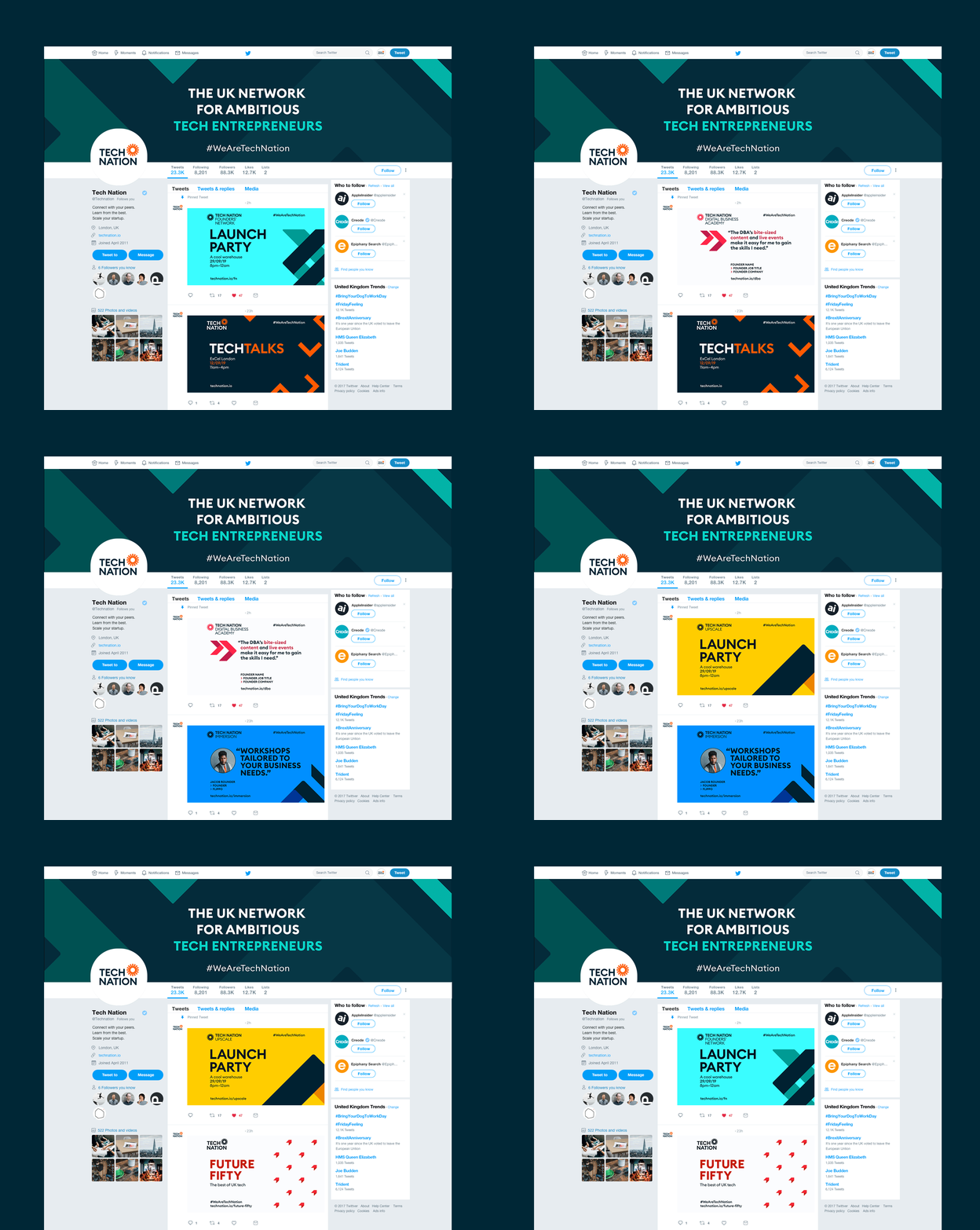
This animation shows how the Programme Brands live together on social. There's a strong connection to the brand family, as well as to the masterbrand.
Tech Nation Insta profile
Branded Facebook Programme post shows how the brand pops in a feed


